
Introduction
Great craftsmanship doesn't win every bid. Contractors who show up in a beat-up truck with no logo, wearing whatever shirt was clean that morning, lose jobs to competitors with weaker skills but a stronger presence.
That's the uncomfortable truth about construction today. Homeowners and GCs can't inspect your framing before they hire you, so they judge you on what they can see: your truck, your signage, your website, your crew.
Branding goes beyond the logo — it's the consistent visual and experiential identity that builds trust before a client ever picks up the phone. This guide covers the strategy behind a strong construction brand, how to design a visual identity that signals professionalism, and how to bring that brand to life on trucks, signage, and jobsites.
Key Takeaways
- Strategy, covering positioning, values, and differentiation, comes before any logo or colour choice
- Consistency across trucks, signage, uniforms, and your website builds recognition over time
- Colour should reflect your work type and be pulled from real project photography, not guesswork
- Vehicle wraps and jobsite signage remain some of the most cost-effective, always-on advertising tools contractors have
What Does "Branding" Actually Mean for a Construction Company?
A logo is one visual asset. A brand is the entire experience a client has with your company, starting with their first Google search and ending with the final walkthrough.
That distinction matters more than you might think. Your brand includes:
- How your website reads on a phone at 9 p.m. when someone's comparing quotes
- Whether your estimator's truck looks like it belongs to the same company as your website
- How your crew talks to a homeowner standing in their own kitchen
- Whether your invoice looks like it came from a real business or a Word document
Trust drives this entire equation. In Edelman's 2024 Trust Barometer, trust ranked ahead of customer service, reputation, and even convenience when people chose between brands. Fully trusting a brand produced a 63-point jump in purchase likelihood.
That trust gap shows up daily in a fragmented, crowded industry. Hundreds of thousands of construction businesses compete for the same homeowners and general contractors, often within a few hundred dollars of each other's bids.
When pricing is nearly identical, brand presence is frequently the deciding factor. You get the callback when your business looks organized, consistent, and established. You lose it when you look like a side hustle.

Build the Strategic Foundation Before You Design Anything
Here's the mistake almost every contractor makes: they jump straight to picking a logo and a colour before deciding what the company actually stands for. That's backwards.
Positioning comes first. Before you touch a design tool, answer these questions:
- What do you want to be known for? Speed, communication, a specific trade specialty, or flawless cleanup?
- Who is your target client — residential homeowners, commercial GCs, or institutional buyers?
- Why did your best three clients actually hire you?
Call those clients. Ask them directly why they picked you over someone cheaper. Their answers will surprise you, and they'll hand you your positioning on a plate.
Your messaging needs to shift depending on audience, too. A homeowner researching a kitchen remodel responds to warmth and reassurance, while a commercial GC scanning subcontractor bids wants proof of reliability and scale. Speaking to both in the same tone usually satisfies neither.
Define Your Positioning and Differentiation
Every trade has the same recurring complaints: crews showing up late, poor communication, messy jobsites left for the client to clean up. Your brand promise should directly counter whichever complaint your ideal client fears most.
Before finalizing anything, spend an afternoon researching two or three local competitors' branding. Look at their trucks, their signage, their websites. If your palette and messaging look identical to theirs, prospects won't be able to tell you apart on a jobsite two doors down.
Write Down Your Mission, Values, and Brand Voice
Skip the generic "quality and integrity" language every construction website already uses. Instead, write values in plain terms a crew member could repeat on a jobsite.
Compare these two approaches:
- ❌ "We are committed to quality craftsmanship and customer satisfaction"
- ✅ "We call you back the same day. Every time."
- ❌ "We take pride in a clean and professional job site"
- ✅ "We sweep, haul debris, and bag the scraps before we leave. Every job."
The second version is a promise you can measure and a crew member can understand well enough to live by it.
Design a Visual Identity That Signals Professionalism
Your visual identity — logo, colours, typography, tagline — has to work at two extremes: a business card handed across a kitchen table, and a 20-foot truck wrap seen from a highway. Most logos fail one of those tests because they're designed only for a screen.
Choosing the Best Colours for a Construction Brand
Colour psychology research backs specific associations rather than a rigid industry rulebook. Peer-reviewed marketing research links blue to competence and red to excitement, and confirms colour shapes brand personality, likability, and purchase intent.
In practice, contractors tend to split along these lines: residential and institutional brands often lean on warm earth tones and approachable blues that read as trustworthy and personal, while commercial and industrial brands more often use bold, saturated colours that project authority and scale.
There's no universal formula here, so test your options against real jobsite photos and material samples rather than a colour wheel on a screen. A palette that looks sharp in Photoshop can clash badly with brick, siding, or steel in the field.
Whatever you land on, limit yourself to two or three core colours and apply them everywhere: trucks, hard hats, invoices, uniforms. UPS has built decades of instant recognition around a single signature brown used consistently since 1919. Two colours used relentlessly beat five competing for attention.

Logo, Typography, and Symbolism
Skip the generic hard-hat clip art. Every construction company's logo looks the same when it leans on stock icons. Pull symbolism from your actual work instead:
- A home-building specialist might weave a rooftop line into the wordmark
- A structural or commercial contractor might use a subtle beam or truss motif
- A regional builder might reference local geography or materials
For typography, pair one clean, professional sans-serif for legibility with a single accent font for personality. Resist the urge to use more than two typefaces total.
Before you sign off on a final logo, test it at both extremes: shrink it to business-card size and blow it up to truck-wrap scale. If details disappear or the proportions look wrong at either end, revise it before it's on 15 vehicles.
Bring Your Brand to Life Across Every Physical Touchpoint
A brand only builds trust if it shows up consistently everywhere a client encounters your company, not just on a homepage nobody's updated since 2021.
Vehicle Wraps: Your Fleet as a Moving Billboard
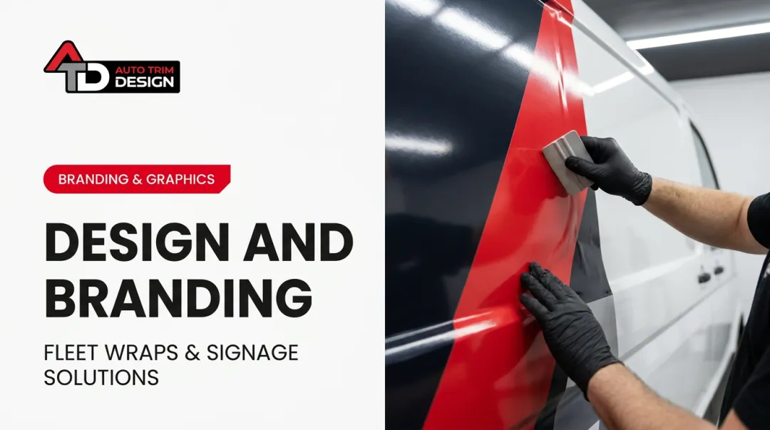
A properly wrapped fleet functions as mobile advertising with no recurring media cost. Unlike a paid ad campaign that stops the moment you stop paying, a wrapped truck keeps working every time it's parked at a job, idling at a light, or driving the highway.
According to 3M's research on fleet graphics, branded vehicles can generate between 30,000 and 70,000 daily impressions, and 64% of people surveyed said they noticed vehicle graphics on the road. For a contractor running multiple trucks between jobsites daily, that's an always-on presence competitors paying for billboards simply don't get.
The quality of the wrap matters as much as the design. This is where working with a certified fabricator makes a real difference. Auto Trim DESIGN has spent over 41 years wrapping fleets across Canada and holds 3M Platinum Select Fabricator certification, a status held by only a handful of companies nationwide. That certification translates into practical advantages for a construction fleet:
- Precise, Pantone-level colour matching across every vehicle in a fleet, so a truck wrapped in January matches one wrapped in October
- Premium 3M and Avery Dennison vinyl backed by manufacturer warranty coverage
- Eco-friendly, solvent-free printing options using recyclable vinyl
When Auto Trim DESIGN rebranded roughly 350 vehicles nationwide for Avenir Energy, from Vancouver Island to Newfoundland, the project depended on exact colour consistency and staggered scheduling so vehicles stayed on the road through peak season.

A construction company managing 10 or 50 trucks across job sites faces the same core challenge on a smaller scale: keeping every vehicle branded identically while none of them can afford downtime.
Jobsite Signage and Wall Murals
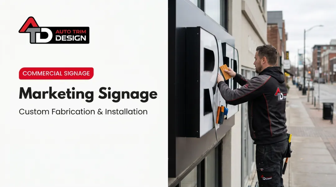
Your truck isn't the only physical touchpoint. Yard signs, jobsite banners, and interior wall murals in your office or showroom extend the same brand to neighbours, passersby, and visiting clients.
Every one of these should reinforce the exact colours and logo used on your trucks. A jobsite sign in a slightly different blue than your fleet reads as sloppy, not intentional. Consistency here is what turns a single job into a recognizable presence across an entire neighbourhood or commercial strip.
Uniforms and Crew Presentation
Trucks and signage get noticed from across the street, but crew presentation is what clients evaluate up close. Matching branded uniforms signal a coordinated, professional operation rather than a handful of workers who showed up separately. Homeowners and GCs both read crew presentation as a proxy for how the rest of the job will go.
Keep uniforms tied to the same colour and logo system as your trucks and signage. A crew in mismatched shirts undercuts a beautifully wrapped truck parked right next to them.
Common Construction Branding Mistakes That Cost Contractors Clients
Even contractors who invest in a decent logo often undermine it with avoidable mistakes.
- Inconsistency between channels. A truck touting one message while an outdated website says another makes prospects doubt the business is still active. Lucidpress's brand consistency research found 24.5% of organizations cite this exact kind of confusion.
- Copying competitors' colour schemes. Generic hard-hat imagery and borrowed palettes make it impossible for prospects to tell one contractor's jobsite from another's.
- Over-promising in marketing. Claiming "always on time" or "zero callbacks" sets an unrealistic bar, and in tight-knit trade communities, a broken promise travels fast.
None of these mistakes require a bigger budget to fix. They require discipline and a system everyone on the team actually follows.
Frequently Asked Questions
How do you brand your construction company?
Start by defining what your company stands for, then build a consistent visual identity, logo, colours, wraps, and signage, applied everywhere. Back it up with service delivery that matches what your branding promises.
What are the 5 C's of branding?
There's no single verified "5 C's" framework in branding. The commonly cited "3 C's"—clarity, consistency, and constancy—apply directly to keeping a construction brand recognizable across trucks, sites, and marketing.
What are the best colours for branding a construction company?
Warm earth tones and blues tend to suit residential and institutional brands, while bold, saturated colours suit commercial and industrial work. Test any palette against real jobsite and material photography before finalizing it.
How much does it cost to brand a construction company?
Costs vary widely based on fleet size, signage scope, and uniform quantities, so there's no fixed industry-wide number. Request a quote based on your specific vehicle count and coverage needs rather than budgeting from a generic estimate.
Do subcontractors need their own branding?
Yes. Even subs working under a GC benefit from a professional look. Wrapped vehicles and clean invoices influence which GCs call first when new work comes up.
How long does it take to build a recognizable construction brand?
The visual elements (logo, wraps, signage) can be completed within weeks. Genuine market recognition typically takes many months to a couple of years of consistent, repeated exposure.